Special Feature
Although it is abrupt in this article designated "Instruction on the Methods of Using Applications," the lead players in Cho Kanji are the data the user creates. In contrast, the applications play supporting roles that aid the data. If we liken the relationship between applications and data in Windows to a situation in which applications acting like rival warlords have enclosed data saved in independent formats, then in Cho Kanji we could probably liken it to a situation in which reigning data (plural) are attended by lots of applications. Understanding this relationship between data and applications is the first step.
In Cho Kanji, we call the substance of the data a real object; real objects are all in the form of standardized data formats: TRON Application Databus (TAD). TAD, so to speak, is a large container, and inside this it is possible to divide and store things of different types, such as text and figures [graphics].
In viewing or editing the contents of a real object, we perform this by relating an application to the real object and then starting up that application (which opens into a window). For example, if we're editing text, it comes about that we relate and start up the Basic Text Editor, and if we're editing figures, the Basic Figure Editor. As for the relating of a real object and an application, a user can also do it manually, but real objects in a state in which the process has been performed beforehand and can be immediately used are provided. We call these real objects templates. We could also express this differently and call a template a sample prepared for each data type.
Next, we will explain the operations by which we take out a template and begin using it.
|
|
Select "Template List" from the Utility menu. The Template List window will appear, and the templates will be lined up inside (Fig. 1). 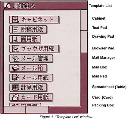 The ones that are listed here are the templates of currently registered applications that create real objects (Table 1). When newly registering an application, if it possesses a template, that will be added in this window. 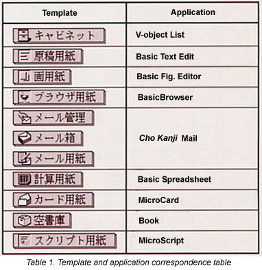 |
|
|
Grab the template you wish to use and drag it to another window for work use (Fig. 2). 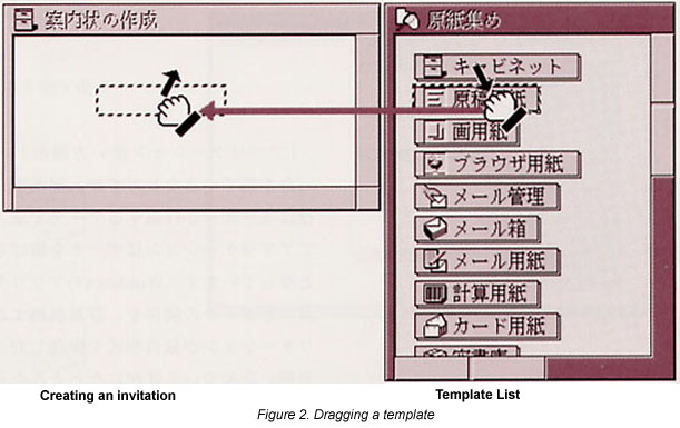 |
|
|
As a panel for inputting a new real object name will appear, input a name from the keyboard, and then click the [Set] switch (Fig. 3). Regarding the operation in (2), internally processing takes place in which the operating system reproduces the template and creates a new real object. For that reason, the user is asked for a new real object name here. 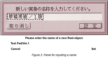 |
|
|
A virtual object that displays the name input in (3) will appear in the window where the template was dragged (Fig. 4). 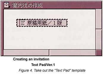 |
|
|
Double click on the virtual object, and after it opens into a window, carry out editing. |
Hereafter, we will individually explain four basic applications [TN 1] included as standard equipment in Cho Kanji--the Basic Text Editor, the Basic Figure Editor, the Basic Spreadsheet, and MicroCard--and their operations after having created new real objects from their corresponding templates. Furthermore, as the Internet-related Basic Browser and Cho Kanji Mail are explained in "The Internet with Cho Kanji" in this special feature (p. 47), please take a look at that article.
The Basic Text Editor is an application for creating text. We will begin using this by taking out a "Text Pad" template to which the Basic Text Editor has been related.
|
|
Take out a "Text Pad" template (Fig. 4). |
|
|
Double click the newly created virtual object. The window
in Fig. 5 will open. We call the [ 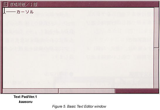 |
We will now explain various types of settings we would like you to know in using the Basic Text Editor.
View Modes
In the Basic Text Editor, three view modes have been prepared for the purpose of writing text. There is no change to functions such as inputting characters or touching them up, but it's convenient if we divide them and use them depending on the type of work. We switch the view mode by using the View menu.
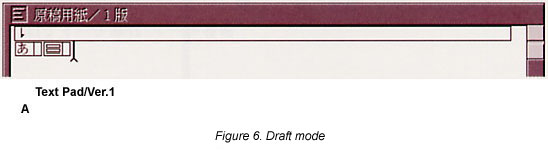
Draft Mode
We use this when we are inputting text without being conscious of the layout (Fig. 6). Specification of the character size, font, etc., are not reflected in the view.
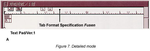
Detailed Mode
We use this when we make fine adjustments, including the layout of such things as the size and font of characters, positioning, etc. (Fig. 7).
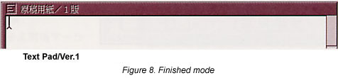
Finished Mode
We use this in normal text editing (Fig. 8). When the window opens immediately after the we take out the Text Pad template, it is in this finished mode.
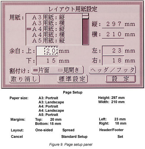
Page Setup
The page for printing has been set as in Fig. 9 as the standard. In a case where modification is necessary, select Page Setup from the Format/Print menu, call up the Page Setup layout panel here, and make the settings.
Horizontal Writing and Vertical Writing
Horizontal writing has been made the standard. In switching to vertical writing, select Vertical in the Format/Print menu.
Format
The format has been set in the following manner as the standard. In a case where modifications are necessary, make revisions to the various values after switching the view mode to detailed mode.
Paragraph Spacing: 1/4 Line Space
Paragraph spacing refers to the space between the line that ends with the new paragraph symbol [
] and the next line. When modifying the spacing, press the paragraph space mark [
] on the tab format specification fusen [tag], and then select new paragraph spacing with the menu that appears.
Line Spacing: 1/4 Line Space
Line spacing refers to the space at the time of a line change where there is no new paragraph symbol. When modifying the spacing, press the line spacing specification fusen [
], and then select new line spacing with the menu that appears.
Character Spacing: 1/8 Character Space
When modifying the spacing, select a new space with Character Spacing under the Format/Print menu.
Tab Position: Four-Character Space
The tab position is specified with the [
] on the tab format specification fusen. If you'd like to change the tab location, move the [
Font
The Mincho font is the standard font. In a case where you would like to set it to a different font, select a new font from the Font menu.
Style
Proportional pitch style has been set as the standard. In a case where you'd like to set a new style, select a new style from the Style menu.
Font Size
Ten-point is standard. In case you'd like to set it to another size, select a new size from the Font Size menu.
When the various settings are finished, let's save the modified contents by selecting "to the Original Real-object" from the Save menu. Furthermore, these settings can be modified at one's discretion even during the inputting of characters.
Next, we will explain various functions that assist the editing of text.
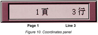
Coordinates Panel
When you select show Coordinates Panel from the Edit menu, the coordinates panel will appear on the upper right of the window (Fig. 10). The location of the cursor will be displayed in the coordinates panel.
Window Width Wrap Menu
In the finished mode and the detailed mode, when the width of the form is greater than the width of the window, the text view ends up getting up cut off on the left and the right, and thus it is necessary to scroll in reading the hidden places.
When you select "Window Width Wrap" from the View menu and place it in the ON state, it comes about that the text will always fold in the widow width, without being dependent on the form width.
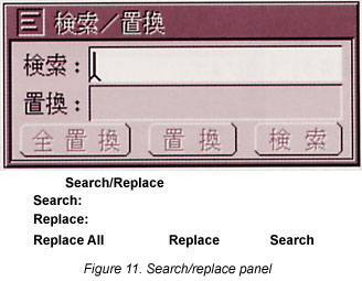
Search/Replace Panel
When you select Search/Replace of the Edit menu, the search/replace panel will appear (Fig. 11). By specifying a search key, you can search for character strings and replace them.
Above, we have explained the methods of using the Basic Text Editor (Text Pad). Please make use of it in drafting texts. Furthermore, for more details on the Basic Text Editor, please look at "Writing Text" in the Help Guide utility.
The Basic Figure Editor is an application for creating figures. We begin using it by taking out a "Drawing Pad" template to which the Basic Figure Editor has been related.
|
|
Take out a "Drawing Pad" template (Fig. 12). 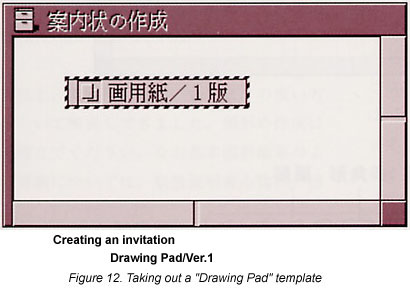 |
|
|
Double click the newly created virtual object. The window in Fig. 13 will open. 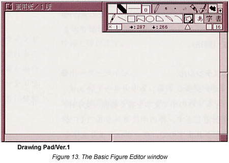 |
When the Drawing Pad window opens, a small window as in Fig. 14 will be displayed on the upper right of the window. We call this the tool panel. By using this tool panel, we select tools for drawing figures, and we can select such things as patterns and the thickness of lines.
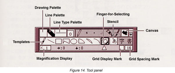
The tool panel is always displayed to the front of the Drawing Pad window. There are no cases when it is hidden in the back. When the tool panel gets in the way, drag the thick portion on the left or the right of the tool panel, and move the tool panel to an appropriate location.
We will now explain various types of settings we would like you to know in using the Basic Figure Editor.
Page Setup
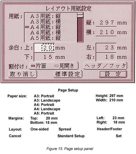
The page for printing has been set as in Fig. 15 as the standard. In a case where modification is necessary, select Page Setup from the Format/Print menu, call up the Page Setup layout panel here, and make the settings.
Grid
With figures, you can draw in any location you like inside the window, but depending on the contents you will draw, arranging figures at equal intervals and being able to draw horizontal and vertical straight lines exactly is convenient. For cases such as these, there is a function in which we bind the location of a figure to a grid. It gives one exactly the feeling of drawing using graph paper.
|
|
Press the grid display mark [ 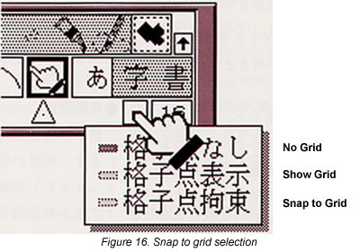
|
|
|
When you select either the Show Grid
or Snap to Grid menu items, the
grid display mark will change to [ 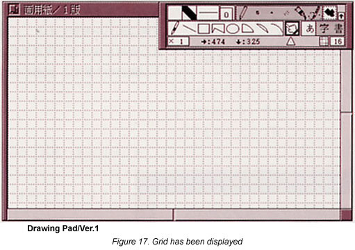 |
|
|
Press the grid spacing mark [ ],
which is on the right next to the grid display mark. As choices
for setting the spacing of the grid will appear, select an appropriate
spacing (in dot units). ],
which is on the right next to the grid display mark. As choices
for setting the spacing of the grid will appear, select an appropriate
spacing (in dot units). |
When the application is in the Snap to Grid state, the locations at the beginning of drawing and the ending of drawing are forcibly revised so that they match with the locations of the grid. This is convenient when drawing parallel or vertical straight lines, or when drawing equidistant figures.
Canvas
After clicking the canvas [ ],
specify the range of a pixel map (a picture made up from a collection
of fine dots) inside the window.
],
specify the range of a pixel map (a picture made up from a collection
of fine dots) inside the window.
Templates
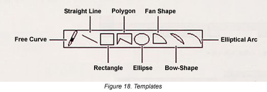
Tools for drawing various types of figures are lined up. After you have clicked a figure and selected it, you can draw it in a free location of the window (Fig. 18).
Stencil
After clicking the stencil [ ],
specify a range (character frame) for writing characters inside
the window. As the cursor [
],
specify a range (character frame) for writing characters inside
the window. As the cursor [ ]
will appear inside the frame, input characters from the keyboard.
]
will appear inside the frame, input characters from the keyboard.
Drawing Palette
This specifies the inside of closed figures you draw with a
template, pixel map colors, and colors of the background portion
of character frames. The standard color is white. Press the drawing
palette [ ],
and then select the color you like with the menu that appears.
],
and then select the color you like with the menu that appears.
Line Palette
This specifies the lines of figures you draw with templates,
and the color of the characters that you input in character frames.
The standard color is black. Press the line palette [ ], and then
select the color you like from the menu that appears.
], and then
select the color you like from the menu that appears.
Line Type Palette
This specifies the type of the lines in figures you draw with
the templates. Press the line type palette [ ],
and then select the type of line you like with the menu that appears.
],
and then select the type of line you like with the menu that appears.
Next, we will explain the various functions that support the editing of figures.
Magnification
We can change the magnification of pictures we display inside
the window in nine stages, from 1/8 to eight times. By enlarging
a figure, we can adjust the fine parts, and by reducing a figure,
we can survey its entirety. The standard is one time (actual size).
Press view magnification [ ],
and then select the appropriate magnification with the menu that
appears.
],
and then select the appropriate magnification with the menu that
appears.
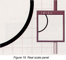
Real Scale
When you select view Real Scale Panel from the View menu, the Real Scale Panel will appear (Fig. 19). In the window, the last edited location and the surrounding area will be displayed at a magnification of one time.
Above, we explained the ways of using the Basic Figure Editor (Drawing Pad). Please put it to use in creating figures. Furthermore, for more details on the Basic Figure Editor, please look at "Drawing Figures" in the Help Guide utility.
The Basic Spreadsheet is software for inputting numbers and characters inside a window in which squares are lined up, and doing various calculations among them. We call this collection of squares a sheet. We begin using them by taking out a "Spreadsheet" template to which the Basic Spreadsheet has been related.
|
|
Take out a "Spreasheet" template (Fig. 20). 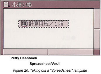 |
|
|
Double click the newly created virtual object. The window in Fig. 21 will open. 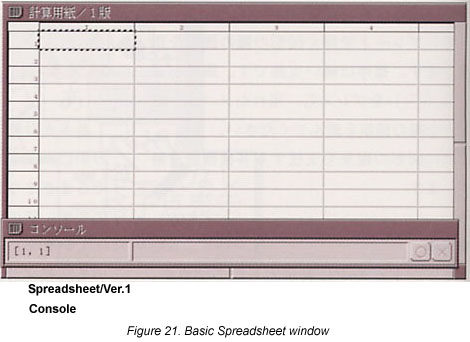 |
When you open the Spreadsheet window, a small window as in Fig. 22 will be displayed at the bottom of the window. We call this the Console. Using this Console, we input values and write in the specifications of ranges.
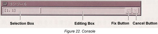
The Console is always displayed to the front of the Spreadsheet window. There are no cases when it is hidden in the back. When the Console gets in the way, drag the thick portion on the left or the right of the Console, and move the Console to an appropriate location.
In using the Basic Spreadsheet, understanding the organization of the table (sheet) is important. First, we will explain from this point (Fig. 23).
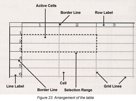
Cell
We call one square a cell. Inside it, we can enter data such as numbers, characters, formulas, and real objects.
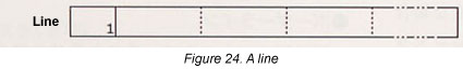
Line Label
Line numbers 1~8192 are displayed. We call collections of cells lined up horizontally lines (Fig. 24).
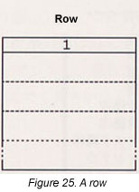
Row Label
Row numbers 1~256 are displayed. We call collections of cells lined up vertically rows (Fig. 25).
Grid Lines
We call the straight lines that are drawn at the cell-to-cell borders grid lines.
Border Lines
We call the boundary lines inside line/row labels that divide the number-to-number spaces border lines. You can modify the size of a cell by dragging the border line.
Cell Coordinates and Range
Inside the sheet, we use coordinates in indicating the location of a cell. Coordinates are something akin to a so-called cell address. There are two methods for expressing coordinates (Fig. 26).
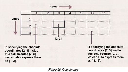
One is absolute coordinates. This is a method in which we specify the cell location by using the numbers of the line/row labels. We express this with the format of [line number, row number]. A comma ',' is entered between the line number and the row number. For example, [10, 8] specifies a cell in the location of line 10, row 8.
The other is relative coordinates. This is a method in which we pay attention to an arbitrary cell that lies on the sheet, and we specify in terms of a location seen from that cell. We express this with the format of [± line number, ± row number]. For example, when a location is focused on the cell [10, 10], [+1, -1] specifies one line down (the eleventh line) and one line to the left (the ninth row).
Once you've reached the point where you have an understanding of the structure of the table, let's make sheet settings for doing work. First, we decide on the size of the sheet for work. In selecting the range of the cells, it is convenient to use the Console.
|
|
Double click the Console selection box and input the range. For example, in a case where we specify a range in which we make the cell coordinates [1, 1] into the upper left hand corner, and the cell coordinates [31, 4] into the lower right hand corner, we input [1, 1 : 31, 4], and then press [Enter] (Fig. 27). 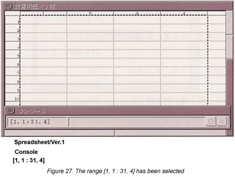 |
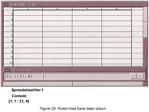
Inside the sheet, a broken line that delimits the cell space has been drawn. This line is something that is displayed only on the screen so that the cell boundaries are easy to understand. In a case where you would like to print a delimiting line, it is necessary to draw a ruled line.
|
|
Select [Ruled Line] from the [Cell] menu. A panel for setting ruled lines will appear (Fig. 28). 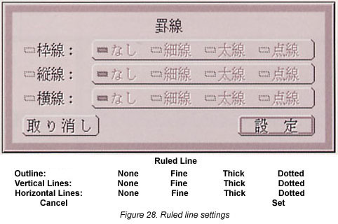
|
For example, let's try making the outline thick and the vertical and horizontal lines thin. On the panel, click [Outline], and next click [Thick]. In the same manner, click in the order of [Vertical Lines] and [Thin], and then in the order of [Horizontal Line] and [Thin], and finally click the [Set] switch (Fig. 29).
Next, let's set the value expressions input into the cells. We make the settings after selecting the cell range in which we make them into the same expression.
|
|
Using the Console, select the range in which you will set the expression. |
|
|
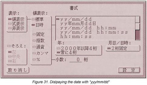
Select [Format] under the [Cell] menu. A panel for setting formats will appear (Fig. 30). 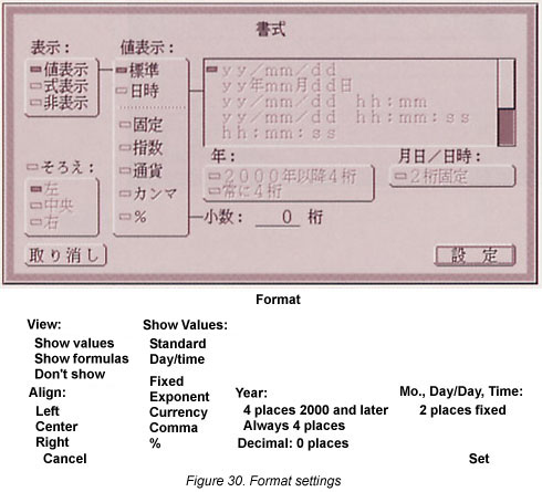 |
For example, in a case where you would like to display dates with "yyyy/mm/dd" (y: year, m: month, d: day), under "Shows values," set this by clicking in order "Day/time," "Year: Always 4 places," and "Mo., Day/Day, Time: 2 places fixed" (Fig. 31).
Finally, click the [Set] switch. Also, as you have not input data into the sheet, there won't be any changes inside the window, but the format will be set in the selected cell range.
Using the first line of the sheet for the title happens a lot, but when you scroll in the up-down direction as is, the title ends up disappearing. For that reason, by fixing the title, we can make it so that the title is always displayed at the very top, even though we do scrolling.
|
|
Click the line label of line number one. The entire first line will be selected (Fig. 32). 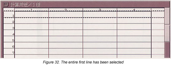 |
|
|
Select [Set Title] from the [Sheet/Print] menu. A mark that shows the first line has been fixed will appear on the left edge of line number one (Fig. 33). 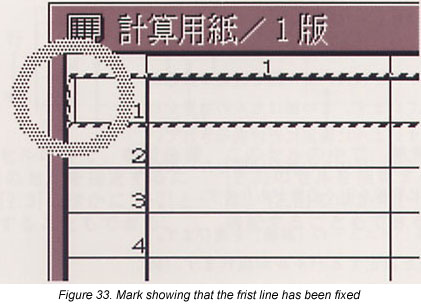 |
With this, the setting of the sheet is finished. Please try inputting data into each cell. Furthermore, for more details on the Basic Spreadsheet, please look at "Using the Spreadsheet" in the Help Guide utility.
MicroCard is card-type database software. One screen corresponds to one paper card--this is the basic concept of a card-type database. For example, in the case of managing addresses in an address list, we use it by making it so that we write in one item's portion of information in one screen. We begin using it by taking out a "Card" template to which MicroCard has been related.
|
|
Take out a "Card" template (Fig. 34). 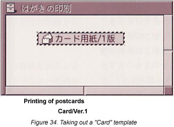 |
|
|
Double click the newly created virtual object. The window in Fig. 35 will open. We call this window the card window. 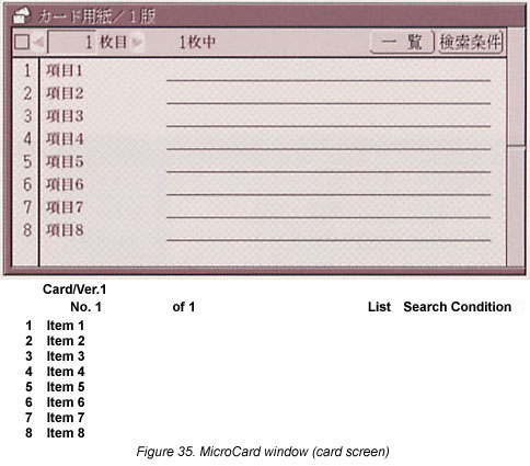 |
We will now explain various functions we would like you to know in using MicroCard.
Screens
In MicroCard, three screens with different functions have been prepared. We switch the screen by using the [Screen] menu.
Card Screen
This is a screen in which we input data and view it. When the window opens immediately after we have taken out a Card template, it is in this screen (Fig. 35).
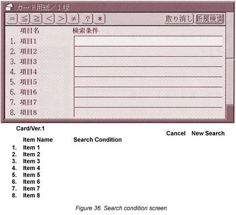
Search Condition Screen
This fetches a card that satisfies fixed conditions from among the cards that have been entered. The search functions this screen realizes are one of the great advantages of managing data on a computer. You can display the search condition screen (Fig. 36) just by clicking the [Search Condition] button, which is in the upper right hand corner of the card screen.
Design Screen
This carries out the design of cards. In beginning to use a database, first designing an appropriate card for the data to be arranged hereafter is the first step. We will give an explanation in detail from here concerning the design screen.
List Window
In MicroCard, there is a list window separate from the card window (Fig. 37). The list window shows data from one card in a single line, and thus you can quickly survey input data. In addition, you can shift the line-up order of a card, and it serves as a window when exchanging data among other real objects.
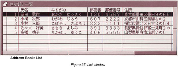
For the list window, you can call it up by either selecting [List] from the [View] menu, or, also, by clicking the [List] switch that is on the upper right of the card screen.
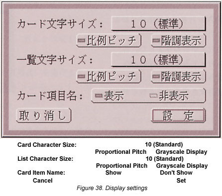
Display Settings
This sets the character size displayed in the card window and list window, and whether to use proportional pitch or display gradation. When you select [Display] from the [View] menu, the panel in Fig. 38 appears.
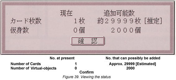
Status
This displays the number of cards that have been created to the present and the number that can possibly be added. Moreover, you can also confirm the number of virtual objects that are included. When you select [Status] from the [View] menu, the panel in Fig. 39 appears.
Next, let's try designing a card. When creating a new database, we design a card matched to the data we will manage.
|
|
Select [Design Screen] from the [Screen] menu. The contents of the card window will switch into the design screen (Fig. 40). 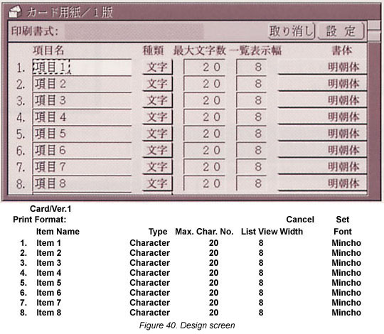 |
Item Name
Input the names of the items. If it's an address book, then postal code, address, person's name, etc., would be fine. Also, as for unnecessary items, the items will be entirely deleted by making the item name into a blank.
Type
This sets the type of data the item will store. When you press
[ ],
as a menu will appear, select from among character, numeral, and
virtual object. Normally, it is fine as is with character. In
a case where we will manage data other other than characters,
such as images, we set it to virtual object.
],
as a menu will appear, select from among character, numeral, and
virtual object. Normally, it is fine as is with character. In
a case where we will manage data other other than characters,
such as images, we set it to virtual object.
Maximum Character Number
This sets the maximum number of characters for the data that can be stored in that item. Because the capacity will end up uselessly increasing if it is too great, just making it have a little room is probably best. We set this by matching it to the data that will be input, in the manner of 20 characters if it's an address, 10 characters if it's a name.
List View Width
This specifies the view width in the list window. To view data of as many types as possible at a single time, we specify it small. Also, when we set the number of characters to 0, they will come to not be displayed in the list window.
Font
This sets the font we use in displaying that item. When you
press [ ],
as a menu will appear, please select a font.
],
as a menu will appear, please select a font.
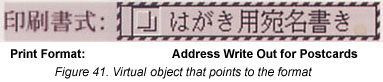
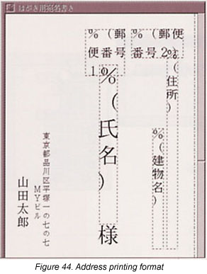
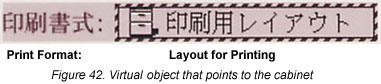
Print Format
This sets the format for when we print the input data. We create the format using the Drawing Pad, and we place the virtual object that points to the format in this field (Fig. 41). Also, in a case where we will divide among and use multiple print formats, we insert the formats into a cabinet, and then place a virtual object that points to the cabinet (Fig. 42). When the special characters below are described inside the format, they are replaced with data inside the card and printed.
% (Item Name)
When we surround the item name with round parentheses, that portion is replaced with that item's data and printed.
% Item Number C
When we place the letter "C" behind the item number, that portion is replaced with the data of that item number and printed.
% Item Number I
When we place the letter "I" behind the item number, that portion is replaced with the item name of that item number and printed.
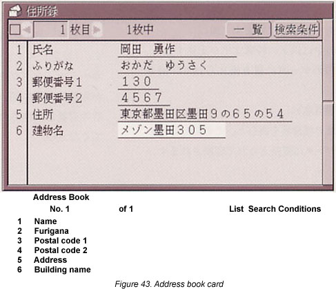
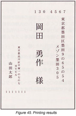
For example, in a case where we create the card in Fig. 43, first we create the format for printing the address on the basis of this data (Fig. 44). The printing results end up as in Fig. 45.
|
|
When the design is finished, click the upper right hand [Set] switch. It will switch into the card screen, and the design modifications will be reflected. When, without clicking the [Set] switch, you either close the card window or switch to another screen from the design screen, the design modifications will not be reflected, so please be careful. |
With this, the design of the card is finished. Please fill in the data and complete the database. Furthermore, for more details on MicroCard, please look at "Using MicroCard" in the Help Guide utility.
|
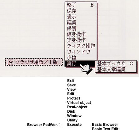
We touched on it in the main text, but the application starting up when you take out a template and double click on the newly created virtual object is because the application has been related to a real object beforehand. Applications that have been related to real objects can be confirmed through the procedures below.
That which is underlined among the submenu items is the application that will start up when it is doubled clicked. In the example in the right figure, when you double click the virtual object "Browser Pad/Ver. 1," the Basic Browser will start up and a window will open. On the other hand, when you select [Basic Text Edit] from the [Execute] menu, the Basic Text Editor will start up for the same real object and a window will open. |
 |
|
In the main text, we explained the utilization of the templates that have various applications prepared for them. However, after you become used to creating data in Cho Kanji, you will come to desire templates more suited to yourself, rather than these general use templates. We call templates that the user creates user templates, and we distinguish the templates the applications provide by calling them system templates. We register user templates through the procedures below.
|
After registering the user template, you can utilize it with the same procedures as a system template. 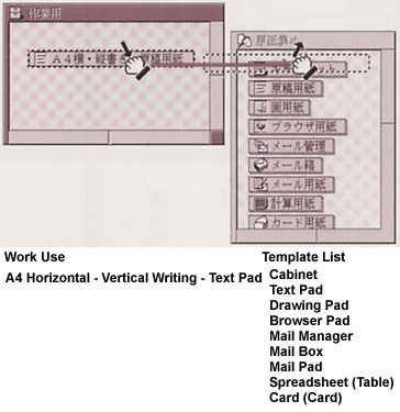 |
____________________
[Translator's Note 1] The translations of the human-machine interface parts in this article are in accordance with the English-language interface kit created by Personal Media Corporation. This English-language interface kit was made available to BTRON users after the above article was written. The complete list of HMI parts that have been translated are:
Also, please note that Basic Spreadsheet and MicroCard have not been translated into English. Accordingly, the translations in this article are not final.
B-right is a registered trademark of Personal Media Corporation.
The above article on the method of using BTRON applications appeared on pages 33-46 in Vol. 74 of TRONWARE. It was translated and loaded onto this Web page with the permission of Personal Media Corporation.
Copyright © 2002 Personal Media Corporation
Copyright © 2006 Sakamura Laboratory, University Museum, the University of Tokyo
 ].
The choices as in Fig. 16 will appear.
].
The choices as in Fig. 16 will appear. ]
or [
]
or [ ],
and inside the window a grid will be displayed (Fig. 17).
],
and inside the window a grid will be displayed (Fig. 17).